BOOKING PLATFORM
My Role
As the Lead Product Designer, I was responsible for user research, ideation, UI design, content strategy, rebranding, and WordPress development. I conducted in-depth research, including user interviews and usability testing, ensuring the final product aligned with stakeholder goals and user needs. Leveraging Google Analytics and CRM data, I established UX acceptance criteria to guide design decisions and validate improvements, ensuring a more intuitive and conversion-focused experience.
Timeline
6 months/2024
Introduction
Hummingbird Wellness is a local wellness clinic that heavily relies on its website presence and local Google ranking to acquire new bookings. The current website for the wellness clinic suffers from several critical issues impacting both user experience and user interface.
Problem
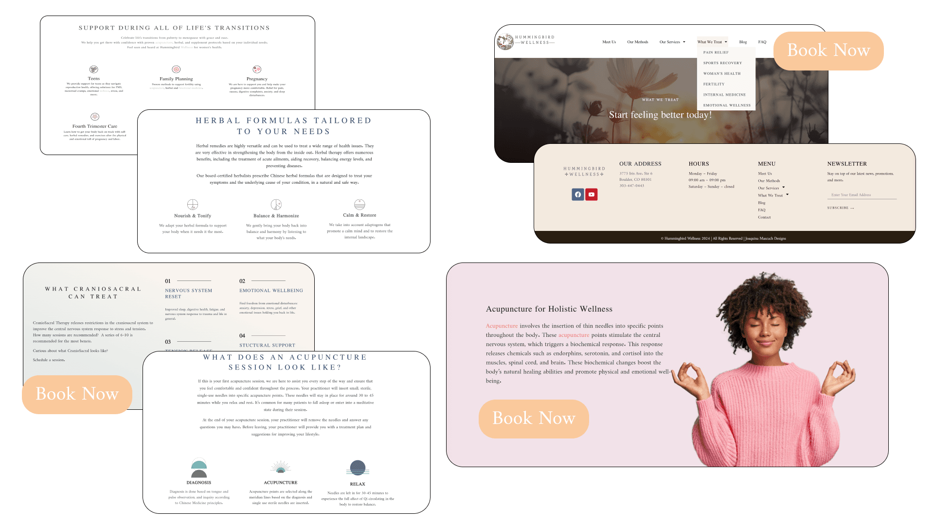
The website suffers from an outdated design, a cluttered and inefficient layout, inconsistent mobile responsiveness, low visibility of call-to-action buttons, and unclear, hard-to-read service descriptions—all of which hinder user engagement and conversions.
Solution
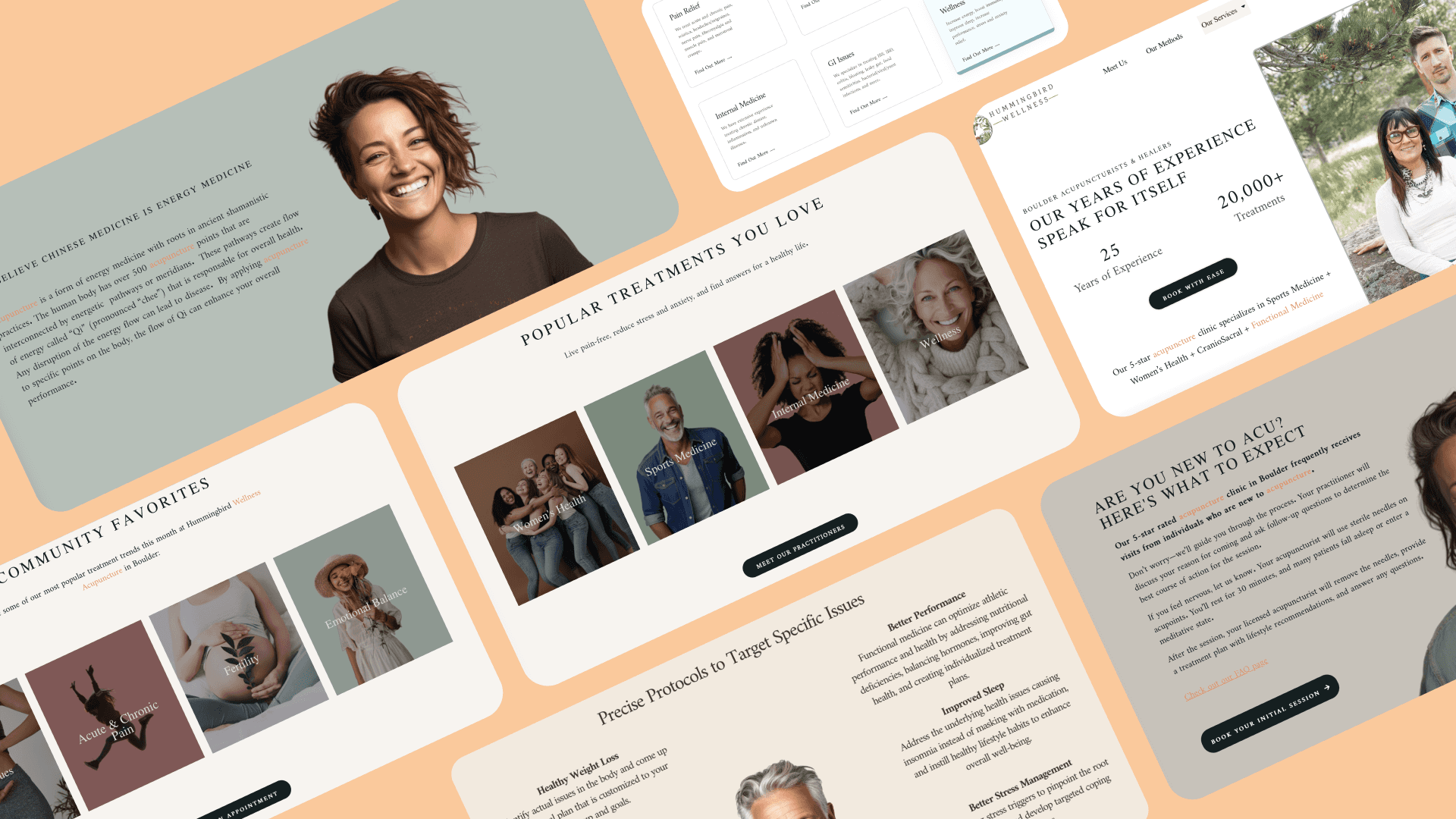
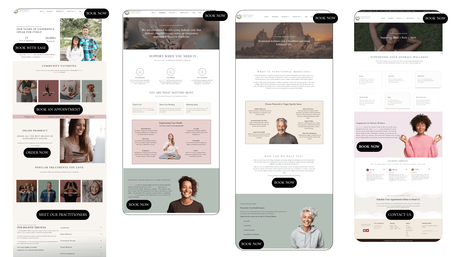
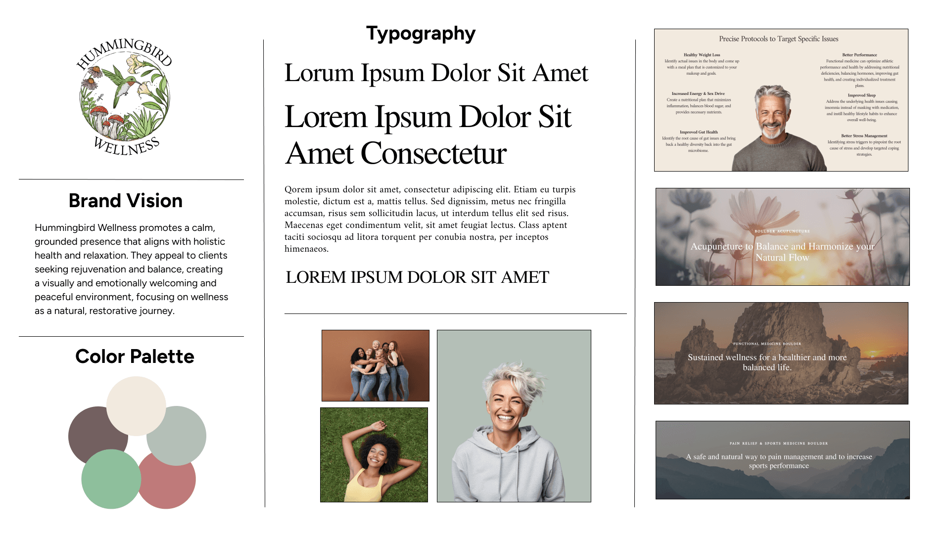
Redesign the website with a clean, intuitive layout, ensuring mobile optimization and clear navigation for a seamless user experience. Implement a visually cohesive design using earth tones that align with the clinic’s branding. Prioritize a prominent booking button and structure service information in a clear, easy-to-read format. Apply user-centered design principles to enhance usability, encourage exploration, and streamline the booking process.
Goals
Design a professional, modern, and intuitive online presence for the wellness clinic that enhances user experience, aligns with the brand’s values of calm and well-being, and drives measurable results. The primary objectives include increasing online bookings by 15% within six months and boosting overall web traffic, ensuring a seamless and engaging user journey.
Research
Does the website work well on mobile devices? Is it responsive across various screen sizes?
What colors, fonts, and imagery do they use, and how does it reflect their brand identity?
How are the services described? Is the content clear, concise, and appealing?
How easy is it to book an appointment? Are call-to-actions (CTAs) prominent and well-placed?
Is the website easy to navigate? How intuitive is the user journey?
Information Architecture
Conducting an information architecture study enables me to strategically structure website content, ensuring a logical flow that enhances navigation, usability, and discoverability, ultimately creating a seamless and intuitive user experience.
The current navigation menu is cluttered and unintuitive, making it challenging for users to find information efficiently. Dropdown links redirect to the top of the same page, adding to the confusion and disrupting the user experience. Creating individual pages for each dropdown option will improve clarity, streamline navigation, and enhance SEO by allowing for more targeted content.
Demographics
I conducted demographics research to understand the wellness clinic’s audience and their website behavior. Analyzing factors like age, gender, device usage, and traffic sources helped me make informed design decisions to improve navigation, enhance user experience, and drive engagement and conversions.
Data from Google Analytics and the CRM booking system revealed that most users were women aged 35-44, emphasizing the need for a targeted design and content approach. Desktop was the primary device, followed by mobile, underscoring the importance of optimizing for both. The homepage was the most visited page, requiring clear service communication and engagement strategies. With most traffic coming from direct sources and referrals, there was an opportunity to improve SEO and digital marketing. These insights guided design improvements for a more user-friendly, engaging, and conversion-focused website.
Solution 01
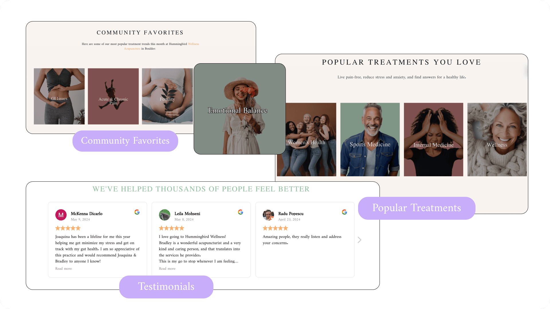
Social Proof: add a carousel of customer reviews to help users book an appointment with confidence. Foster community engagement by highlighting what similar users have chosen. Spotlight what’s trending in the community to encourage a user to book an appointment.
Solution 02
Hick's Law: organize treatment choices by categories, simplify navigation, and chunk information to make decision making smoother. Reduce options to speed up decision making. Highlight recommended options to guide choices. Clear CTA button above the fold and easily located on all pages with "one-click" booking.
Solution 03
Brand: use clear straightforward language to describe services and benefits. Creat a clean layout with earth tones to improve first impression, decrease bounce rate, and reinforce brand identity. Create clear messaging, voice, and values.
Beta testing revealed the website still had too much content in some sections and that the responsive design needed to be optimized on several pages. The user interface (UI) should be designed to enhance navigation, offer user-friendly layouts, and provide interactive features that provide informative content and increase engagement.
Interactive Popups
Provide on-demand information without navigating away from the page and helps manage limited screen space while providing additional information without overwhelming the user. A trigger by click option is less intrusive and improves satisfaction with the website.
Revised Navigation Dropdown
Move page content to navigation and add separate pages for each category to conserve screen space and improve layout. This will increase engagement while empowering the user to have control over their interactions with the website.
Accordion dropdown list feature:
This feature organizes information into clearly defined categories, making it easier for users to understand the structure of the content and find what they are looking for quickly. This will also lead to faster loading times, improved mobile navigation and accessibility, and increased user engagement.
So many lessons! Here are a few I am still learning so much about.
Design Process
Through this project, I refined my design process by implementing structured workflows, documenting iterations, and using project management tools to stay organized. Systematically organizing research findings and design decisions streamlined the user experience while breaking tasks into phases ensured a focused and efficient design approach.
Technical Complexity
I gained hands-on experience optimizing a WordPress theme for mobile responsiveness, improving page speed, implementing SEO best practices, and conducting usability testing to ensure a seamless and high-performing user experience.
Don't Delete That!
Throughout this project, I learned the importance of tracking design iterations, as I often needed past changes for reference. To improve, I systematically saved versions, documented decisions, and used version control tools while avoiding deletions, as discarded ideas can be valuable. This experience reinforced the need for thorough documentation and an organized workflow—an area I'm still working to refine!
